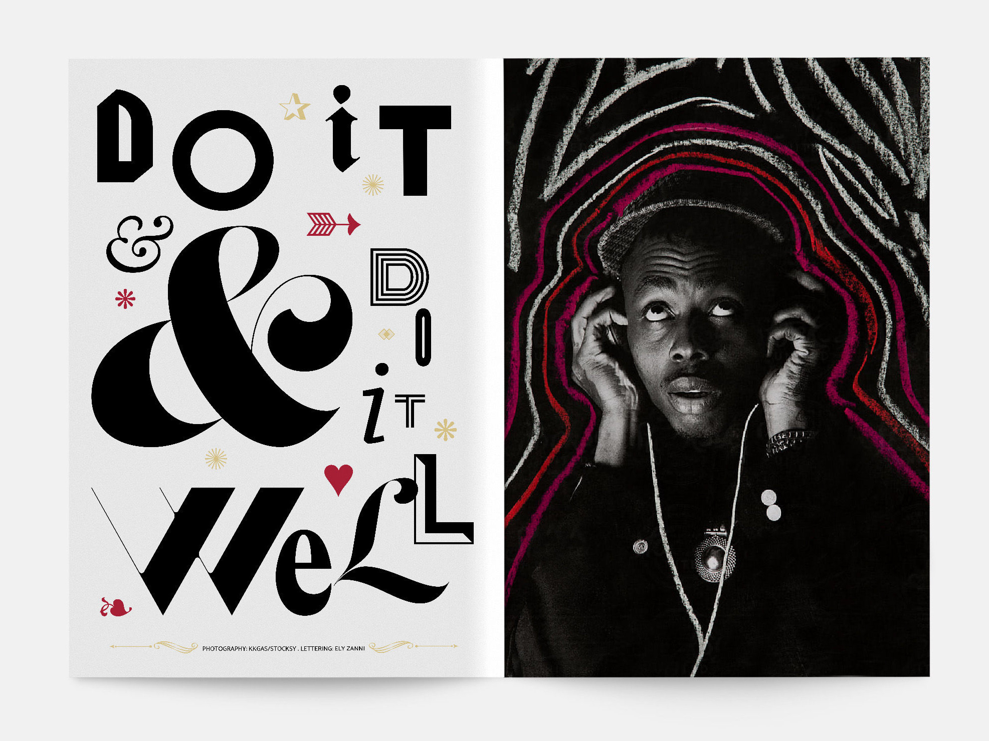
La Vie en Rose | Lettering & Editorial design
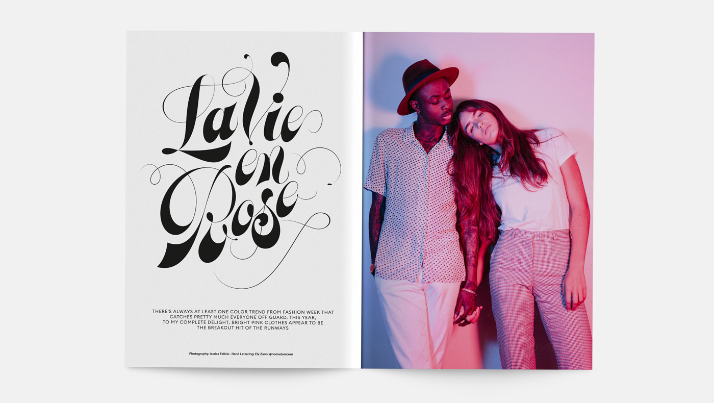
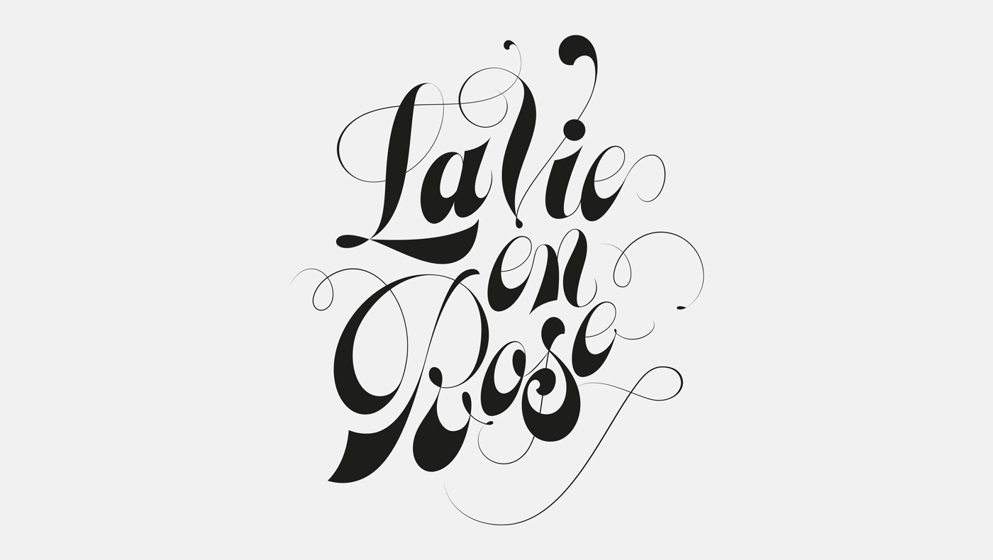
Non commercial work and lettering inspired by the Copperplate and Spencerian calligraphy styles, created to illustrate the phrase 'La vie en Rose'. I thought these would be perfect fit for a magazine lettering as the beautiful flourishing and embellishments of both styles radiate that 'la-la-la feeling' that comes from the concept of a harmonic, idilic life, where everything is seen in rose colour.
—
Client: Personal Project
Year: 2020
Year: 2020