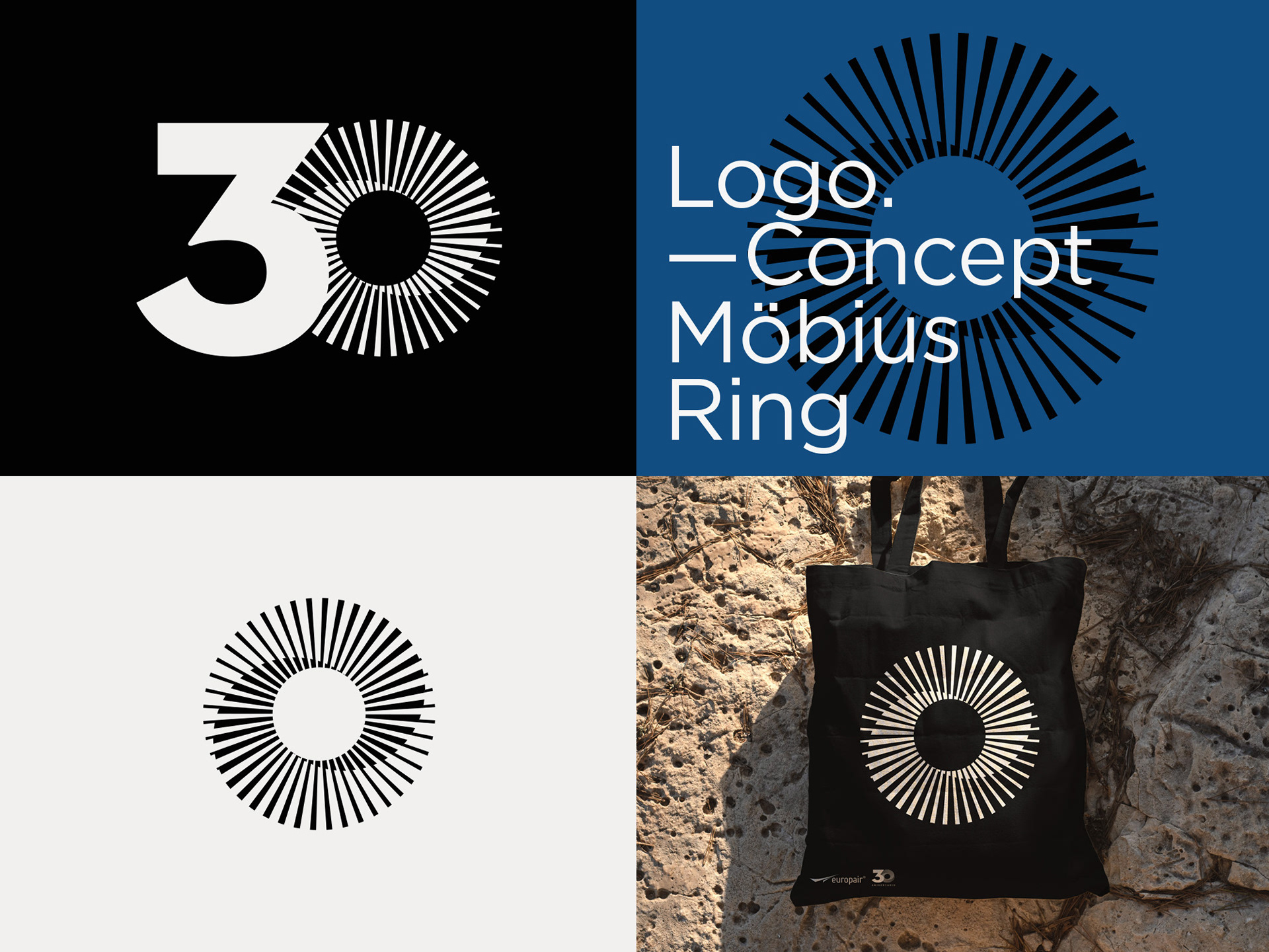
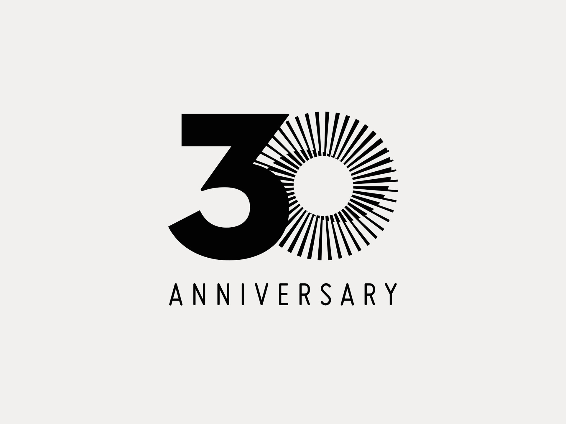
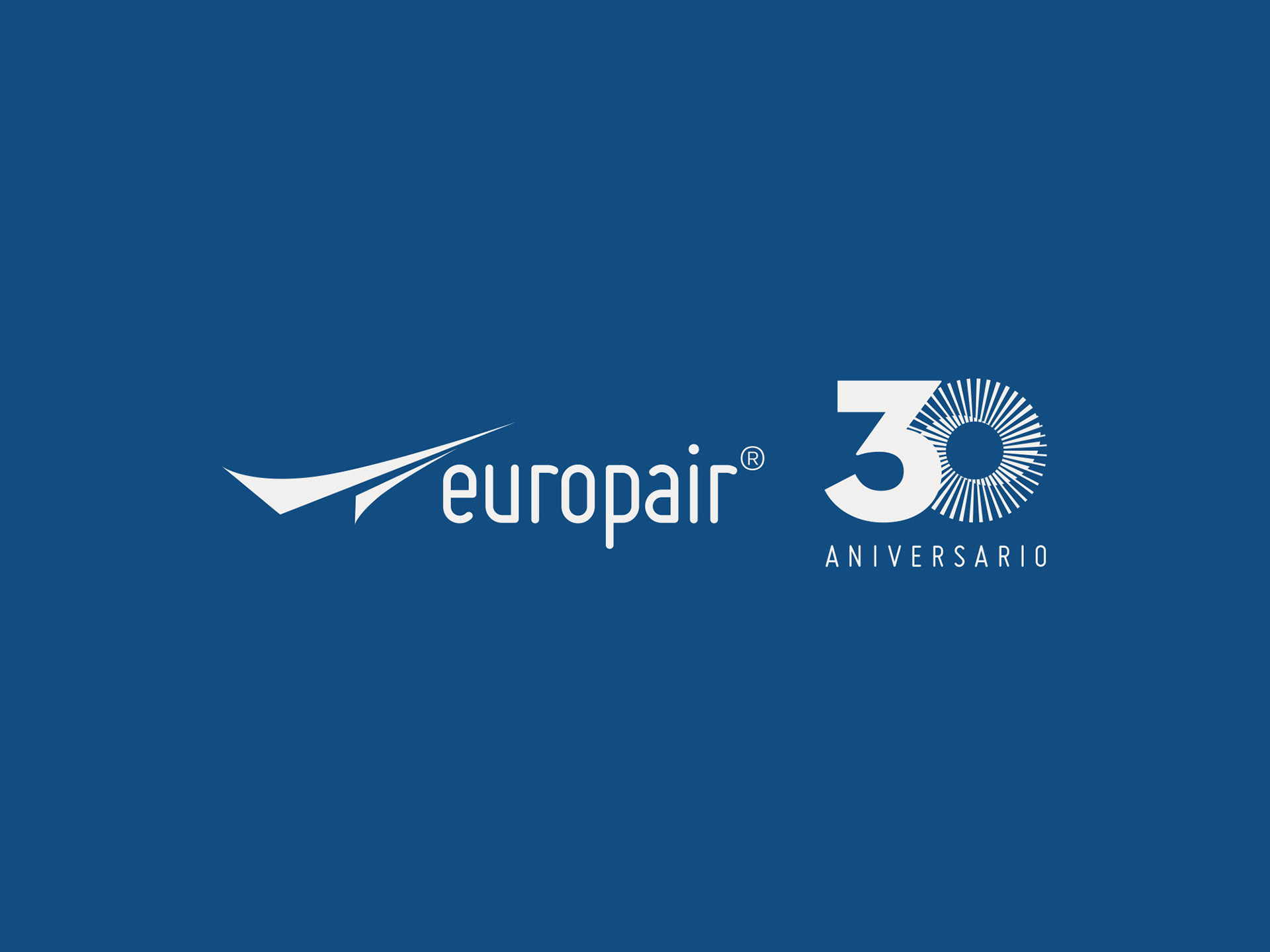
30th Anniversary logo design for Europair
Europair, a company specialising in charter flights for individuals and businesses, approached me to design a logo for their 30th anniversary. They gave me full creative freedom, with only two requirements: the logo should have both a Spanish and English version, and it would be used exclusively on the top of their website and in email signatures next to their company logo throughout the anniversary year.
The entire design process, from concept development to final presentation, took 4 to 5 days. The chosen design effectively captures Europair’s legacy while maintaining a seamless connection to their corporate identity. This project was a great opportunity to craft a memorable and meaningful anniversary logo for Europair, celebrating their 30 years of excellence in the charter flight industry.
—
Client: Europair
Year: 2024
Concept & design approach
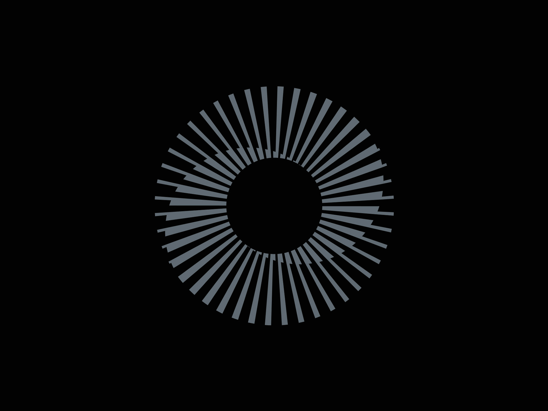
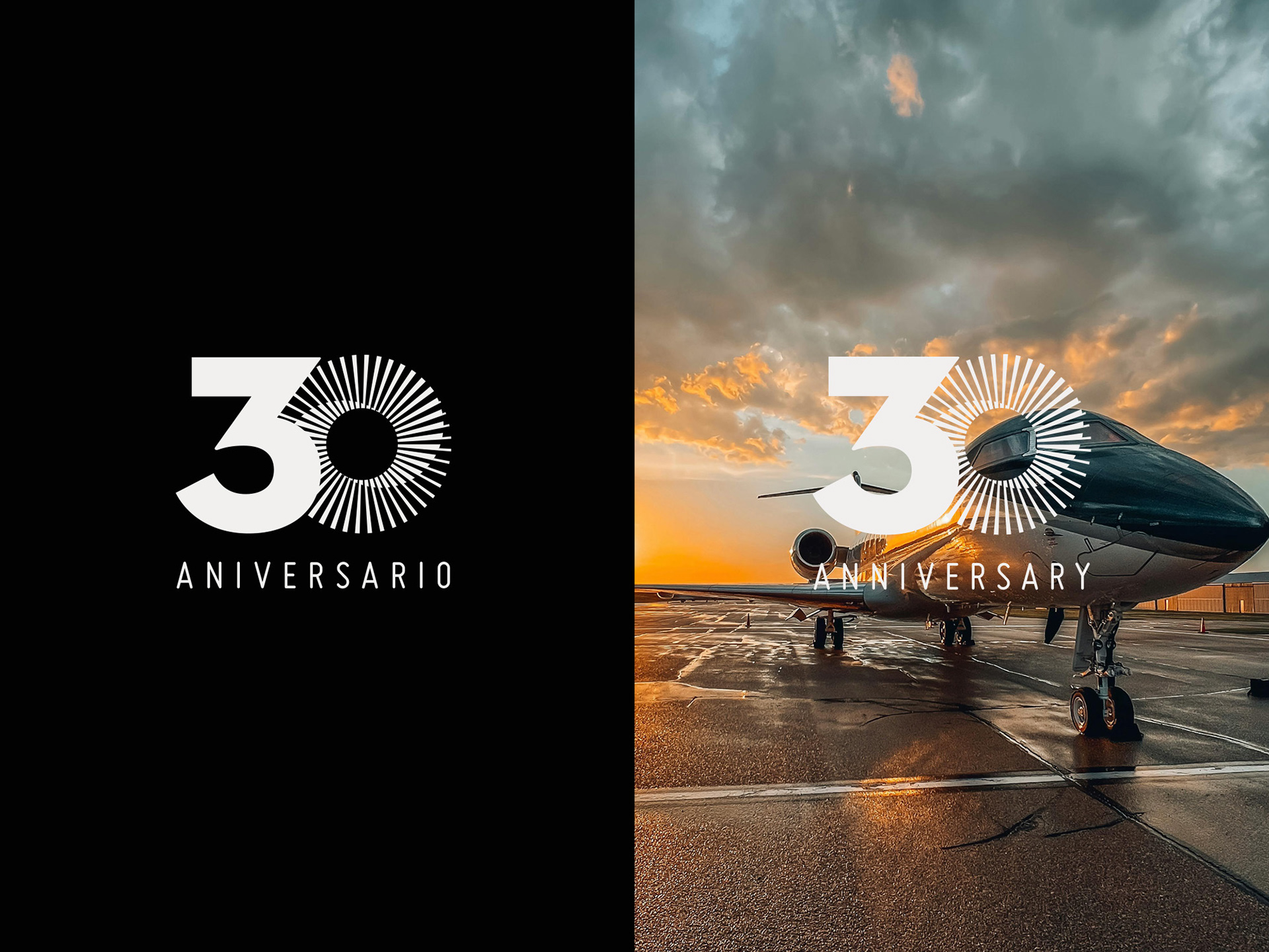
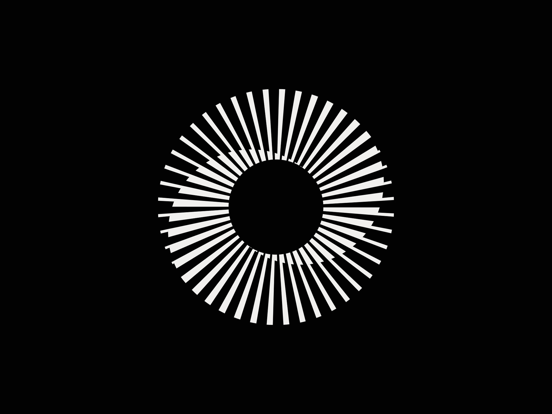
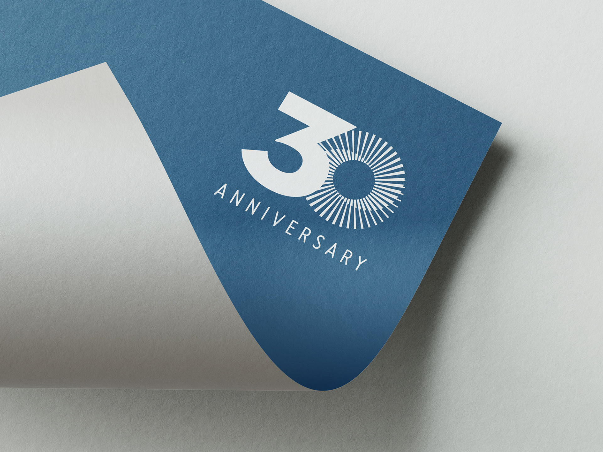
For the design concept, I drew inspiration from aircraft turbines, which led me to create a stylised number 30, where the zero is replaced by a Möbius ring. This Möbius ring represents continuity, growth, and constant movement, all of which align with Europair’s journey in the aviation industry. At the same time, its shape resembles an airplane turbine, symbolising air travel and power.
Typography & color palette
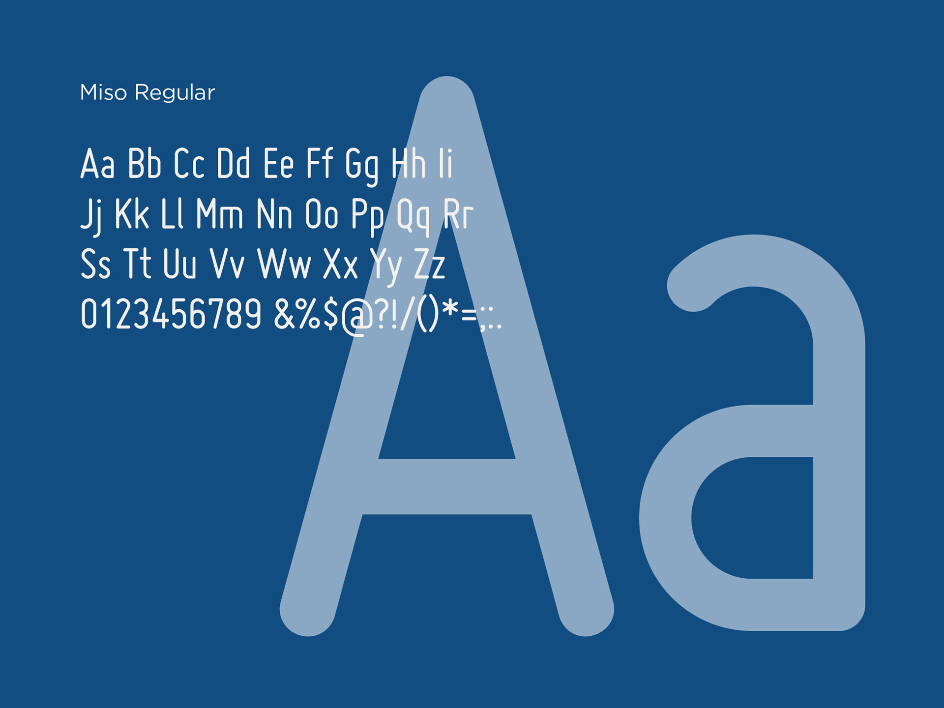
To ensure consistency with Europair’s corporate identity the word ‘Anniversary’ uses the same Miso font as their existing logo.
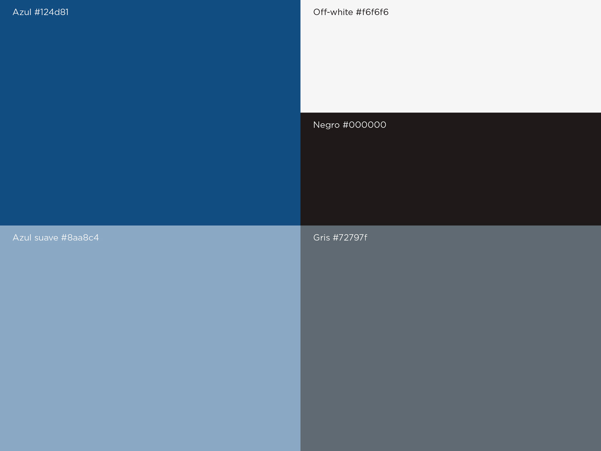
The colour palette remains true to Europair’s brand colours: dark blue, light blue, and grey.
Presentation & final selection
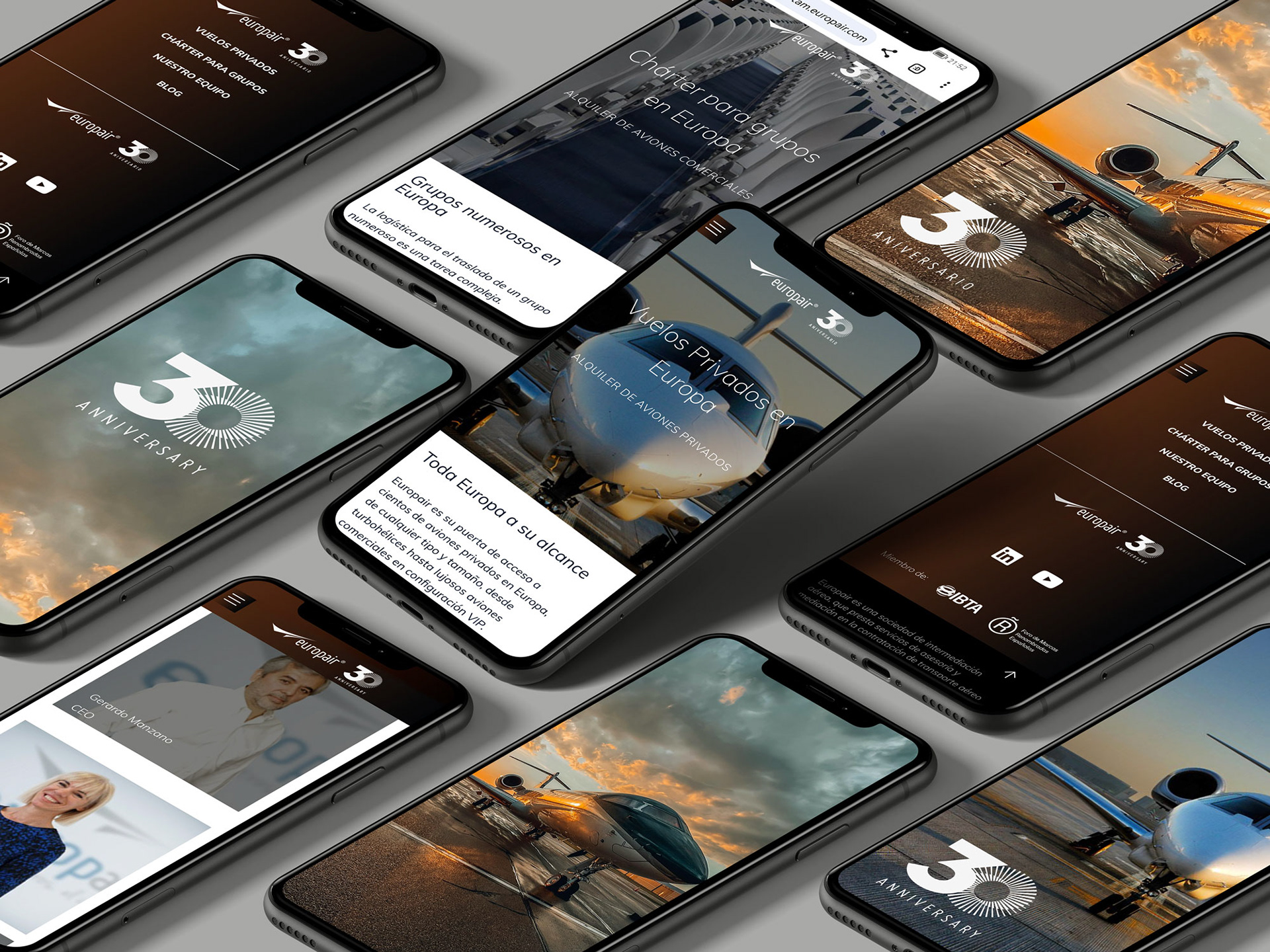
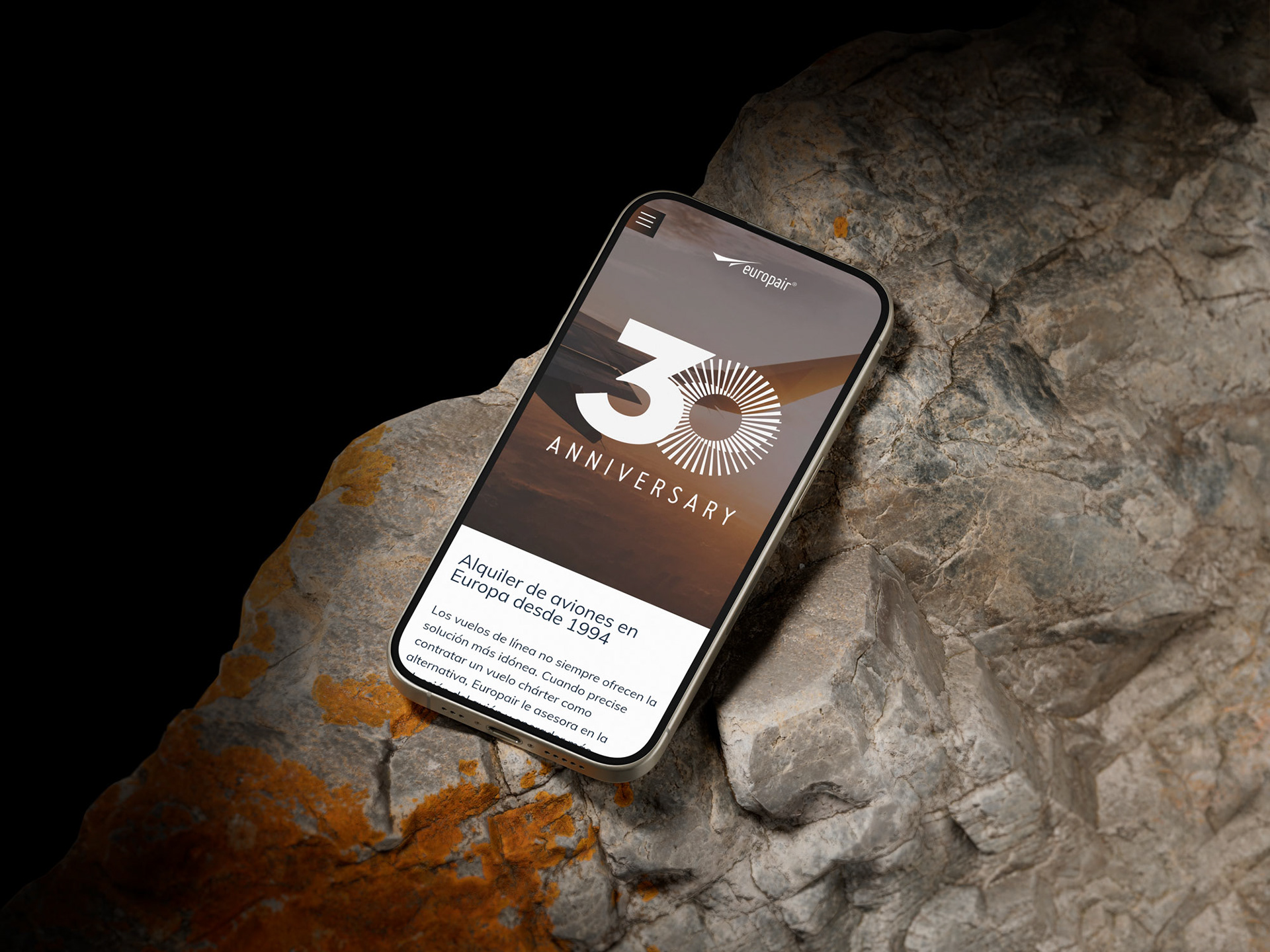
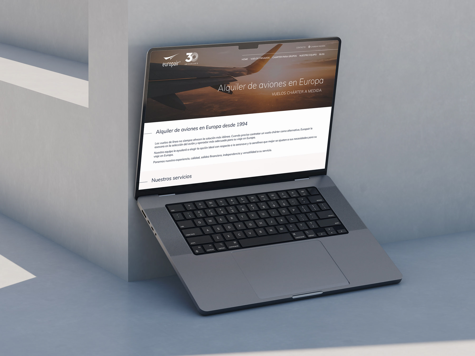
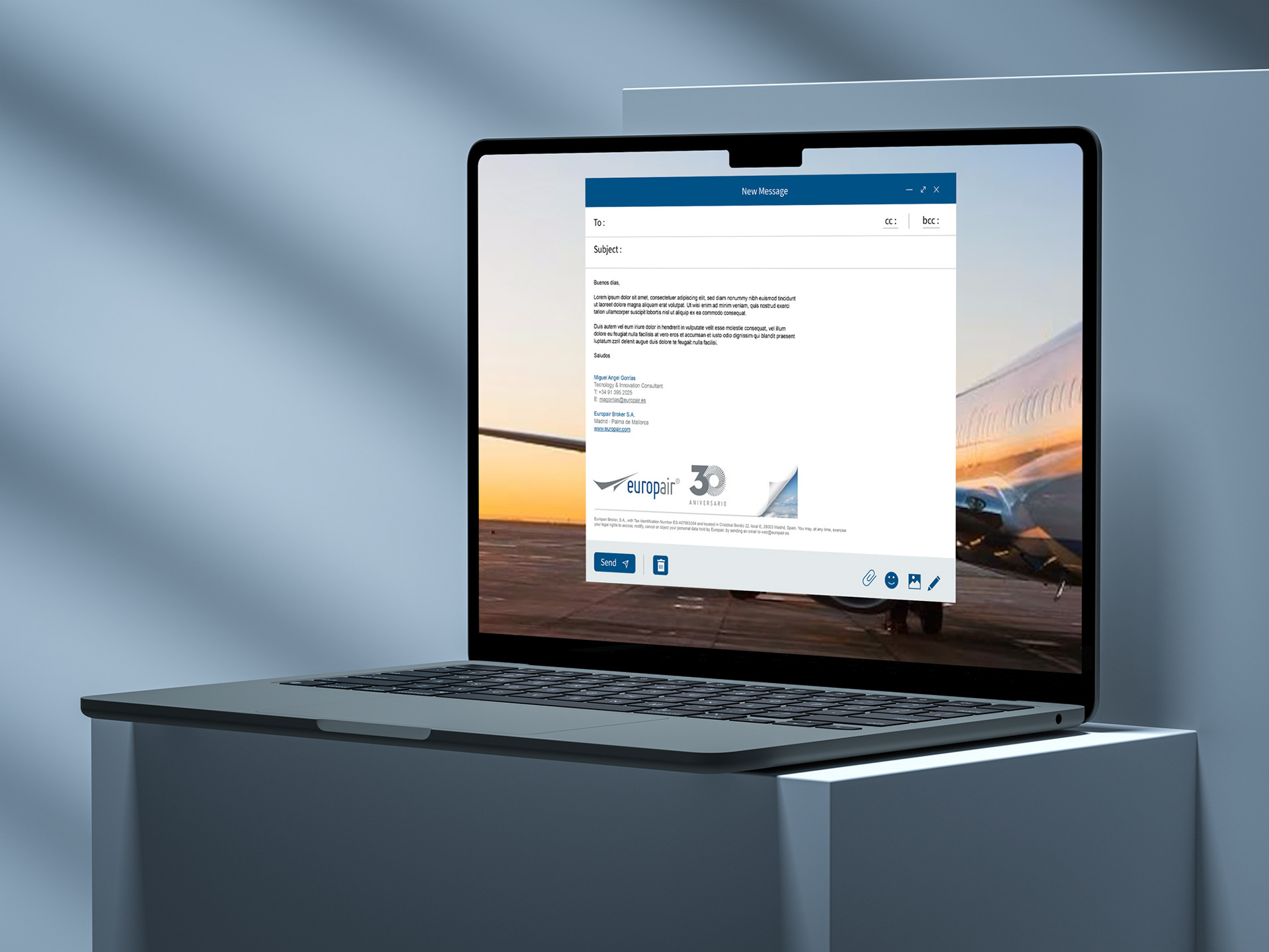
To showcase the logo in action, I created several mockups demonstrating how it would appear across different devices, including mobile and desktop screens, as well as in email signatures. I presented two design options, and the Europair team selected one without requesting any modifications.
Sketches & creative process
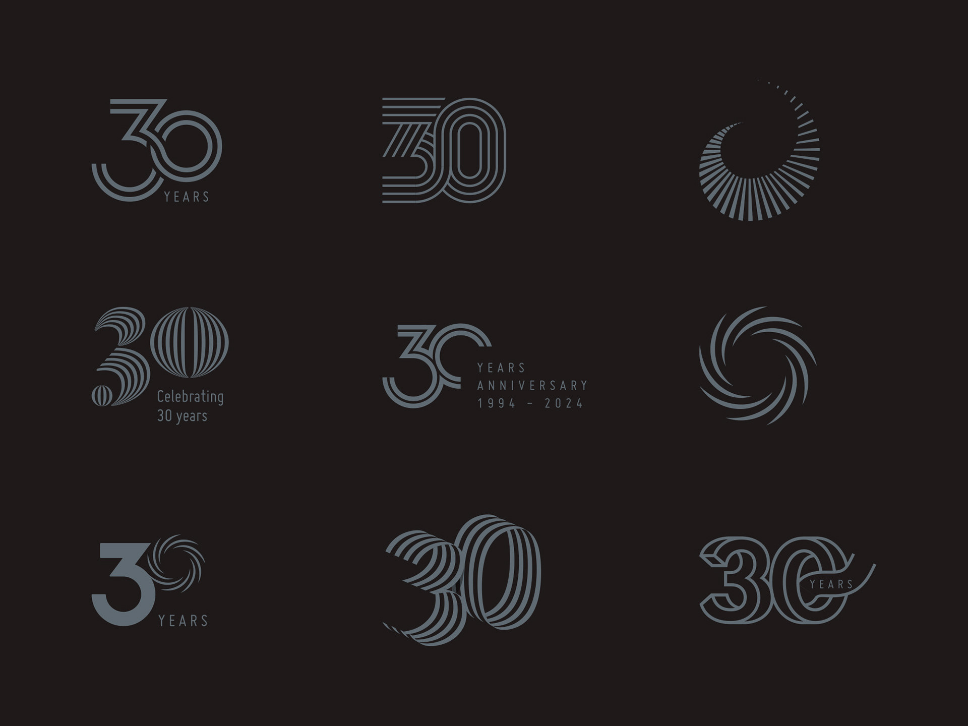
To refine the final concept, I explored multiple design directions, experimenting with different ways to incorporate the number 30 and aviation-related symbols. I sketched various turbine-inspired shapes and Möbius ring variations before settling on the final design. Some early concepts focused more on abstract motion lines, while others experimented with different placements of the anniversary text. These discarded concepts and sketches provide insight into the iterative creative process that led to the chosen design.
Thank you for watching!
—
I’m available for work!
DM me if you need a logo, branding or illustrations
Welcome to discover more of my work and connect:
Instagram | Red Bubb|e | Bluesky | Dribbble